

Responsive Revolution: Mastering Web Design with the Top 10 Frameworks
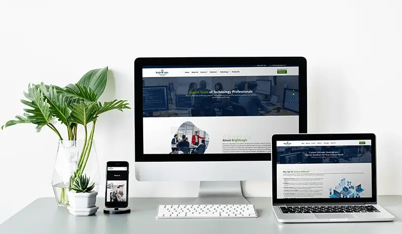
In the fast-paced world of web development, ensuring your website stays visually appealing and functional on various devices is crucial. Responsive web design frameworks streamline this process, saving time and maintaining quality. Let's dive into the top 10 frameworks that promise seamless website development:
- Pure CSS:
Lightweight and mobile-first, Pure CSS offers a range of modules for easy customization. Ideal for front-end developers looking for a minimalistic approach. - Skeleton:
Fast and responsive, Skeleton adapts to web projects of any size without compromising quality. Known for its organized file structure, reducing development time for aesthetically pleasing results. - Montage:
Boasting scalability, Montage ensures UI elements remain viable across various devices. Preferred for single-page applications, it facilitates a smooth user experience. - Material UI:
Aligned with Google Material Design, Material UI provides React components for extensive front-end functionalities. Ideal for projects demanding complex UI features and functionalities. - Bootstrap:
A reliable choice for quick website development, Bootstrap offers a mobile-first approach and customizable themes. Perfect for beginners and startups, creating device-agnostic websites effortlessly. Also Read: What's new in Bootstrap for Front-End Developers? - Semantic UI:
Known for its third-party style guidelines, Semantic UI provides a variety of UI elements. Offers extra customization options compared to Bootstrap, ensuring flexibility in design. You Might Like: Comparison Between Semantic UI & Bootstrap - Foundation:
A simple yet powerful framework suitable for designing web and mobile apps, websites, and templates. Incorporates navigation, layouts, and media libraries, perfect for responsive design. - Simple Grid:
Ideal for cleaner web project designs, Simple Grid excels in establishing a user-friendly front-end. Reduces code lines, resulting in a lightweight framework suitable for various layout sizes. - Gumby:
Gaining popularity, Gumby offers a flexible grid, responsive design, and well-defined UI. Utilizes Sass for quick project development and includes a built-in customizer for easy tweaking.Suggested Read: What is Sass Preprocessor? - Cascade:
Supporting both semantic and non-semantic grid layouts, Cascade simplifies the design process. Ensures cross-browser compatibility and device-agnostic web UI.
"It's not about 'making' a site mobile-friendly. It's about embracing the fact that the web is inherently fluid."
Selecting the right framework is crucial for a smooth web development journey. Whether you're a seasoned developer or just starting, these frameworks cater to various needs, ensuring your website stays ahead in the ever-evolving digital landscape.

 Let's Chat



Get In Touch


©2026 Moltech Solutions Pvt. Ltd. All rights reserved.